Monday, March 3, 2008

“My Chopsticks Bra,” by Katherine Chu


Introduction

This product named “My Chopsticks Bra “, it is created by the feminine lingerie maker from Triumph International Japan. “My Chopsticks Bra” shapes by a pair of cups that resemble bowls of rice and miso soup, and a set of collapsible chopsticks that tuck into either side. The “My Chopsticks Bra” is the latest addition to Triumph’s line of concept lingerie designed to boost awareness of environmental issues. By using this bra, people can carry their own reusable chopsticks around, in order to help reducing the waste that disposable chopsticks bring to the.environment.

Areas for interaction:

- When people see the bra that the women is wearing, people will think about protecting the environment .

How is this good interaction design?

Trustworthy-

I think this design is very trustworthy because by using this product, it can reduce the negative impact that disposable chopsticks have on the environment.

Appropriate-

I think this product is highly questionable. How would a women take the chopsticks out from her bra at the table without causing the males in the restaurant staring at her ? Well, woman can take the chopsticks out in the washroom.


Smart-

I think it is definitely a smart design. Whenever you want to eat something that need to a tool for help, you can just take it out from your bra and without asking anyone . And also you don't need to worry about if the chopsticks from the restaurant are clean or not .

Clever-

It is a clever design for reducing the disposable chopsticks. Whether than putting chopsticks into the little pocket, you may also put your personal stuff into it , for example : tampon, comdom, money, cell phone, cigarette etc.

Ludic-

How people design the look of the bra is quiet interesting for me, I have ever seen a bra is decorated by a bowl of rice and moso soup. It is fun to look it.

Pleasurable-

It is a pleasurable product because it is a great idea for cutting down the number of disposable chopsticks in order to save more trees and only protect the environment.

Interesting Areas of the Design Process

I think the area that most suitalbe for me is creating the look of the bra.


JibJab Video's


I found picking my favorit inspirational design very challenging because there is so much to choose from. However despite the very inspiring and tempting 3D printers and light animation technologies, I chose JibJab video sendables. JibJab videos are fun and interactive. They are a new (and popular) way of communication. You can place pictures of yourself into funny videos and send them to your friends. These videos are ment to be engaging. JibJab, in a sense turns videos and video making into games which you can personalize and laugh about with your friends. The videos provide a sense of involvment, being a part of society in a very optimistic and uplifting way. There are many funny videos aimed towards different age groups. Generally though, the target audience are young adults. Anyone can access JibJab easily through the internet.


Is this a good interactive design?


Trustworthy: I would say that this design is fairly trustworthy.
The videos are very artistic. It seems people put a lot of heart in them. It is therefore reasonable to assume that people were creating them and expressing their opinions honestly. You can trust them to entertain and get the point across.

Appropriate: there is no way to determine that the design is somehow inappropriate because we have to assume that the impression and the effect on the viewer, that it has, is the intended one. We have no prior assumptions of what it should be or any other uses for that design other then the effect on the viewer that we are getting. What you see is what you get.

Smart: Deffinitly smart. If it is funny and it is not volger it has to be smart.

Responsive: The viewer gets to be responsive. Try and listen to some of these jokes and not be responsive. (Its a mind trap :D )

Clever: Its clever because the combination of music and fast changing imagery produces a very strong affect.

Lucid: The instructions are clear and the use is intuitive.

Pleasureable: The purpose of the design is to make people laugh.

Area of interest in the design team.
I think that each video is a creative process, and that partisipating in any part of it would be a lot of fun. I would love to be part of the team of animators and designers who created the layout and characters for each video. Coming up with the concept, and doing the music and voicing.

References:
http://www.lyred.com/covers/jibjab_-_this_land_is_your_land__2004_election_parody.jpg
http://www.grokdotcom.com/wp-content/uploads/Bryan/jibjab.jpg
http://www.prweb.com/prfiles/2006/11/15/479698/JibJabLogoPRWeb.jpg

amaxing toaster -design characteristcs

trustworthy- i think this product is very trustworthy because you can see that it works instantly and i think that a lot of people would be interested in seeing it work and buy it just for that reason

appropriate- it is simply and easy to use just like a regular toaster and the morning is an ideal time to remind people in a fun way about upcoming events

smart, responsive, clever, lucid- it is all these things as it responds right away. it is very clever and a unique idea that i don't think many people would have thought of

pleasurable- i think the dessign being pleasurable is one of it s strongest features as i could image a person spending lots of time seeing what designs or messages they could come up with and have fun with it.

amazing toaster


The reason i chose this design is that i had seen a lot of other very impressive designs that incorporated technology but this design seems a lot more simple, engaging , and fun. what it is is a electronic message pad that burns your message on to toast. It is a great design because anyone can use it, it doesn't really target a certain age or gender the only requirement is that the user eats toast. It is simple anyone who can write or draw can use it . The toaster is colourful and visually appealing making it more engaging to the user. It also allows the user to be creative and have fun with the product. my favourite elements about this design is how stream line the toaster looks, i think that even if it were to just toast the bread with out the message it would be impressive because toaster are ussually bulky and not visually interesting. also i like how the designers took complicated technology and used it for novelty purposes which is rarely seen, it is refreshing to see technology used in this way. this design also includes a variety of spaces that could hold this toaster because it is so small it would easily fit in to the kitchen in a small apartment were it might have to be stored in a small space. so overall it has good interaction design characteristics because it is compact, colourful, easy to use, and interactive as well as engaging.

Interesting Design--T-Shirt Folder

This is a very interesting design. Nowadays, many people don't know how to fold a shirt, folding a shirt seems so easy, but not everyone can do it and fold it well. This design could help us solve this problem. I like this design because it is very original, simple, and specially this is a DIY design, everyone could follow the video to make it. The material of this design is cheap, you don't have to spend a lot of money and they are easy to find, card board and tape. Also, this design is related to our lives and makes our lives more convenience, you don't have to waste so much time on folding shirts, you could use it everyday. We can have more fun when we are folding a shirt. Imagine that you and your friends are annoyed by folding shirt, this design can help you. Your parents are yelling at you because of the mess room with a lot of shirt, you don't know how to fold them? The shirt folder may be your best friend.

Good design?
-Trustworthy
Since the shirt folder is made by yourself, so "trustworthy" or not is depends on the maker, yourself. But even if it is easy to break, you can make a new one very easy and fast.
-Appropriate
This design is only for folding shirt.
-Smart
This design is smart because it saves time, and convenience.
-Responsive
It is very easy to use, you can only follow the video then you can do it.
-Clever
The designer of this design is clever because he only use 2 materials and simple idea to create a useful design. And everyone can follow the video and make it themselves.
-Ludic
It is a interesting design because it is DIY, it is easy to use and it's like when you are folding a shirt, you seem like using a "machine" to fold shirt, but actually that is a card board.
-Pleasurable
This design makes everyone laugh because of the function. It helps us to save time, and when you are folding shirts, you are having fun with it because you are controlling your own "machine".

mi adidas store


This is an awesome store, Adidas just launched its new store in Paris called “The “mi Innovation Center”. This retail store is a true first that offers their customers a whole new dimension of interaction with adidas products. I think this will change the way consumers shop and makes us feel like we are given the same treatments as professional atheletes. The 1,750 square meter Paris Adidas Sport Performance store occupies two floors on the Avenue de Champs Elysees and features a wide selection of Adidas products. The core part of this store is a pimped mi-adidas sales system, called mi Innovation Center (mIC)
Why this store is so cool? there are new features of the new customization unit in the mIC include:
# A large glossy, black cube is the focal point of the center. Here, customers can customize their own “mi adidas”, with just a few steps walking and running on a catwalk-style scanner, foot and pressure sensors analyze shape, size and pressure points. Using now a larger flat-screen configurator to alter the details of the shoes by simply pointing a finger to the screen. Laser and infra-red technology then translate the gestures into commands. Foot scanning and pressure scanning is done as in the mi adidas stores before.
# New is also a virtual mirror where users can see their personalized shoe on their own foot without even removing ones shoes!
# But customization is not only high-tech: Customers are accompanied by specially trained “adidas experts” who, like a personal trainer, advise on nutrition, exercise and products. With a portable hand-held PC, the sales associates record a consumer’s personal data and desires, creating a user profile that he/she can view at their convenience via the internet.
# In addition to the cube, the center also provides some insight into new approaches of selling standard products: At a table, a sliding carriage can be moved over a desired shoe and then specific product information will appear on the screen via Radio Frequency Identification (RFID) technology


Why I think that this is a good design?

1. Trustworthy

The moment we enter the store we feel a different atmosphere. Adidas has combined technology with high-end interior. A dark glossy cube, a large touch screen monitor and many technology features in the store will lead customers to believe the professionalism and Adidas' promise of satisfaction. And Adidas is one of the leader in sports brand, this Adidas Sport Performance Store is a long-term retail concept, created by adidas’ own retail design team in collaboration with Schwab Architects firm so there's no reason not to trust them on this matter

2.Appropriate

This store is appropriate to the cultural, social context. The location is high profile. Adidas spent five years waiting for a location on Paris' tony Champs-Elysées, reckoning that the store would attract as many as 150,000 visitors per year, 70% of them tourists. The strategy of this new store is to lure a younger generation of shoppers who have been brought up on video games, it's simply a gadget geek's paradise

3.Smart

The design is smart because for example by using the interactive foot scanner, it promises that it will save us time to find the shoes that will fit perfectly for us. And also the virtual mirror is a really smart gadget that enables us to "try" and see how the shoes will look like on our feet before we really buy.

4.Responsive

The touchscreen technology allows the customer to interact easily. It gives feebacks when the customers is pointing through the icons on the screen.

5.Clever

I find that there are many clever features on the store, such as when customers can simply point at images on the cube and laser and infrared technologies interpret their gestures, converting them to commands and then the monitors will immediately give detailed information on Adidas product at the pointing of a finger.

6.Ludic

Adidas believes the entertainment factor is what will help boost sales. "It's a fun technology," It's like a game, A scanner and monitor on top of the case mean each shoe can be digitally "X-rayed" to give information about the model and the technology behind it

7.Pleasurable

today's consumers want the newest developments as well as stylish designs. The futuristic design of the store as well as the hight-tech gadgets promise to give customers pleasing experience.


reference :

http://www.press.adidas.com/DesktopDefault.aspx/tabid-11/16_read-7150/
http://images.businessweek.com/ss/06/11/1102_adidas/index_01.htm

Interesting area in the design team..
I think the area that's most suitable for me is probably the implementation or the making process. I'm more of a craftperson that like to do things with my hands. Other than that maybe I might be good as an enterpreneur.

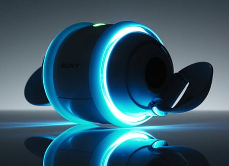
Inspiring interaction design (Sony Rolly ) BY LEO WANG

Introduction: Sony Rolly is a personal electronics device combining music functions with robotic dancing. It moves along with the music downloaded from computer and bluetooth can be set. The Rolly has 1 gigabyte of memory to store tunes, and the battery can last for 5 hours straight.(4.5 hrs if use bluetooth).
Video link: http://www.youtube.com/watch?v=HTxdKi77G20


Attraction: When I first found this design, I was thinking "WOW!! WHAT IS THAT!!!", because I was ATTRACTED to its unique shape. It looks COOL and "SMART". At first, I couldn't figure out what this object is, nor its functions. All I know is that its a Sony product. Later on I found some demonstration videos on Youtube, and learned how Rolly works. I choose this design for the project because it completly grabbed my attention when I first looked at it. Also it is a well designed mp3 player / toy. You can play with it while listening to your fav songs. So far there is no similar product in the market either, which makes it a "one of a kind" design.


Good Interaction Design:

Trustworthy: It looks trustworthy to me, maybe because its a SONY product, and SONY has never failed me beofre. Therefore I trust this is something worth my time. I was uncertain of the functions of this design, due to its weird shape, however I was eager and interested to find out because it looks friendly and harmless.

Appropriate: I think it's appropriate in North America, since music is a big part of our daily lives. This little robot can bring a lot of joy to us by dancing around on our tables, while playing our fav songs. Also, Rolly can be carried around easily because of its small mass. The owner can bring it to a party and show off to friends.

Smart: It's definitely a smart design, all you have to do is to press the button and Rolly will take care of the rest. If people are interested enough to buy this design, they will play with it for sure. Therefore, figuring out the rest of the buttons will be easy too (such as +/- volume, next/prev song). Rolly also has a usb plug, which makes loading songs easy for the owners.

Responsive: Rolly will response depending on the song that is playing. For example, if a song has a silent beginning for 2-3 seconds, of course Rolly will have no response to it. But if it is a Rock & Roll or Rap song, which starts at the very beginning, Rolly will response immediately.

Clever: Its a clever design, I believe. Rolly might look awkward at first, this is because we have never seen anything like it before. Yet, it looks friendly, which makes us want to discover more about it.

Ludic: Rolly is fun to play with because for every song there is a difference dance, so people can always observe the robot doing different kind of movements and spinning around. Also, the change of color of the lights on each side makes it more exciting and fun. If Rolly is being turned on at night, we can see the spinning lights from it.

Pleasureable: Its more of a functionally pleasureable kind of object. Rolly makes feel happy and loosen up from a tiring day. Play with it is a good way to waste your extra times, or when you are trying to escape from work.

Design Teams: I would say I like to participate in the brainstorming group the most, other than that I'm a good pulse taker.

Reference:

Video: http://www.youtube.com/watch?v=HTxdKi77G20

Image1: http://images.google.ca/imgres?imgurl=http://blogs.pcworld.com/staffblog/archives/rolly-1.jpg&imgrefurl=http://blogs.pcworld.com/staffblog/archives/005381.html&h=320&w=320&sz=39&hl=en&start=1&sig2=AC7YvIAwntrdRF65pAb8XA&tbnid=Ajsme69iRtjM-M:&tbnh=118&tbnw=118&ei=L1rMR-D5OZjgigHguuSZDg&prev=/images%3Fq%3Drolly%26gbv%3D2%26hl%3Den

Image2: http://regmedia.co.uk/2007/09/10/sony_rolly_2.jpg

by: Leo Wang 2298263

Xbox Live Service


Xbox live is an online multiplayer gaming service provided to owners of Xbox and Xbox 360 consoles. It became available for the original xbox console in November 2002. Today the service has over one million subscribers


The service opens up a whole new aspect of social interaction. Gamers feel connected and can speak and see each-other with the audio and visual capabilities of the service. Gamer-tags (user's screen names) allow these gamers to personalize themselves on this online service. What attracted me to the design was the ability to connect with players from around the world and play games that I liked. Most of my friends did not have the same affinity for the types of games I was playing so the service gave me an opportunity to play what I liked while being challenged by human opponents. It was also valuable to be able to hear other players speak and send messages.

Some players may take their gaming a little too seriously. In the following video; players argue about the game they just finished. The argument results in name-calling; one of the main aspects of xbox live.


This design is good because it is:

Trustworthy - Xbox live has been running for many years and they constantly make improvements to their service and add new innovations to make it better

Appropriate- Multi-player gaming on a console makes games much more fun. The service came at such a time when online computer gaming was very popular and the XBOX live service might have stolen a few users from that group. Xbox live is marketed differently to the many regions of the world. The advertisements and appearance of games are targeted toward a North American audience.

Smart - Xbox live is very innovative in the video and audio capabilities on a console. The console does most of the work and all the user has to do is play the game and speak to the players in the game.

Responsive - Xbox live is generally quite fast. Sometimes the service can get slow depending on where the players in the game are located in the world. When a player makes an action; the action is transmitted almost instantaneously to the other gamer's screen...this is responsive.

Clever - Xbox live is clever in it's innovations it introduces year to year. Microsoft is also clever at making money. They introduced the option of Xbox Live Silver versus Xbox Live Gold; Silver is free but basically useless while Gold charges money per month or per year to the gamer's credit card.

Ludic - Because this is a online GAMING multiplayer service this category's title pretty much explains itself.

Pleasureable - The service is pleasurable, provided the user does not take the games they play too seriously. No one likes to lose; but it is not the end of the world if one loses a game...unless they are being paid for it.


DESIGN PROCESS

The element that most intrigues me from the design process would have to be the initial vision or brainstorming of the idea. If I were working on the XBOX live service in it's initial stages I would have liked to be the one who came up with the ideas from brainstorming with colleagues.

- All text written by me
- Xbox live logo from xboxlive.com

D. Koe

Glucoboy

http://www.glucoboy.com/

Glucoboy is a video game designed to help children with diabetes keep tabs on the sugar levels in their blood in a fun manner rather then the boring and sometimes painful method on monitoring. Its used with the Nintendo Game Boy or the GRiP incentive-based web community and it provides a game that inter-grates the blood test with gaining extra points, items or lives or unlocks things of valuable.

Trustworthy - Its a video game so kids will be interested in it right away. Parents who hate it when their kids play video games will like this one if their child has a hard time monitoring their blood.

Appropriate - For who its aimed at, its extremely appropriate. Its taken something that kids love to spend a lot of time on and made it something that will help improve their lives.

Smart - Its inter-grated two things together to help make the reality of diabetes less troubling.

Responsive - Its incorporated the blood-sugar testing method so those who have used it will know how it works.

Clever - In tests children have been noted as changing their attitude in getting tested, have kept to the schedules and in cases where children would lose there meters, they have kept tabs on the Glucoboy game.

Ludic - Incorporating the diabetes test with a video game provides an entertaining environment for the user.

Pleasurable - A test made in to a video game, extremely pleasurable.

D'scribe Pen

http://www.yankodesign.com/index.php/2008/02/11/sms-and-email-pen/

Upon seeing the D'scribe pen, I was impressed. To me it just seemed to make sense that there should be a device that allows you to write messages the old fashion way, by pen or pencil, and send it off in an email or a text. What hasn't been explained by the designer is what the user is to do if they make a mistake while writing a message; how does the writer edit the message before sending it? However, while there may be a few problems with it at the moment, I think there will be use for it in the future.

Trustworthy - We all all familiar with pens and pencils and know how they work. All we need to learn is how to send off the message. Plus it may be a sign of relief for anyone who struggles or just doesn't like modern day communications, such as texting.

Appropriate - Its appearance is extremely appropriate for what it does.

Smart - Its remembers what we write and recognizes letter form. Easier then texting.

Responsive - There is a built-in OLED screen on the pen showing the user that there message has been sent.

Clever - Its another option in communication, one that provides people with a method they might be more comfortable with.

Ludic - Its easy to use and learn. After the first attempt the user may want to continue using the pen do to how easy it is to use.

Pleasurable - In terms of function the pen functions like a regular writing device and text messenger. Aesthetically its crafted to look like an fancy, upscale pen.

Sunday, March 2, 2008

Apple IPhone Interactive Advertisement


Apple IPhone Interactive Advertisement

The interaction Design product that I have chosen to write about is an interactive advertisement for the IPhone. This advertisement is laid flat upon the ground for people to view as they walk buy. As people walk over the advertisement, color and motion sensors allow one to view images of the IPhone and the different aspects within the product. What is intriguing about this advertisement is that you do not only have to look at advertisements anymore, but you literally become part of them. To view what the IPhone can do, you must become part of the interaction.

The IPhone Advertisment is an example of “good design characteristics” for many reasons. 1.Trustworthy - Since it is on laid on the floor, it would automatically be considered trustworthy because the floor strong and solid.
2. Appropriate - This interactive advertisement is located in Japan which is appropriate for the culture and environment. Japanese culture is big on cell phone use so this advertisement would do quite well in that environment.
3. Smart – This interactive advertisement is extremely smart. Because it is laid upon the ground everyone who walks by will notice it. Also the lights, color and movement attract ones eye straight to the Advertisement.

4. Responsive – The IPhone advertisement is responsive as soon as you walk over or stand on the ad. As soon as it detects motion the images, lights and colors begin to respond to your own movement.
5. Clever – This advertisement is extremely clever. Apple is trying to make people part of the experience of the IPhone. When people see how inventive and attractive the advertisement is itself, they are automatically attracted to the product and all that the IPhone has to offer.
6. Ludic – The You Tube video shows how playful this advertisement is. The bright colors and dancing figures are the face of Apple. It reacts to you and you are intrigued by the colors and images. As you walk over you see the shadow of yourself, this invites you into the advertisement and makes you want to play and learn more.
7. Pleasurable – This advertisement is pleasurable for many reasons. It looks beautiful, you do not only look at the advertisement but you become part of it. The advertisement reacts to your movement and is responding to your every desire.

If Apple is able to make such amazing and capturing advertisements one can only imagine what the actual IPhone is capable of. Just by seeing this ad and not even getting the full experience I want to not only own an IPhone but also just have the experience of the advertisement itself.

Pet-Tube


Many people come to ocean with many drinks, and after their leisure, many empty plastic bottles remain at a beach, and these all remain as garbage. Nobody wants to take these empty plastic bottles. Here is a good idea!
This is a tube. It doesn’t look like tube, but it is. We can make a tube with several plastic bottles. As we know, a size of every plastic bottle’s covers is same. Therefore, it is designed by using this idea. We can put any plastic bottle at each holes of it, and we finally can make tube very simply. The reason that I choose this product is I think it has the characteristics of good interactive design.

This is really trustworthy design. It is really simple to make, so anybody can make tube by using several plastic bottles very easily. Anybody can make their own tube.
It is also appropriate. Every summer, I had to spend my time to make tube not only mine but also my sisters’ before swimming. However, if I use this product, I don’t need to spend my time and energy to make tubes. It is a good design to enjoy my summer time at the beach.
It is really smart and clever. We don’t need large space to keep and bring it, so we can enjoy our leisure time at the beach with this, and also we can solve a problem that is made from garbage of plastic bottles. People try to collect these plastic bottles for their children, or making their own tube. (I think that if a lot of people use this product as a tube, this system will be helpful……make some place for collecting of plastic bottles at the beach, so people can get bottles easily and also, it will be easy to manage many plastic bottles)
It is also ludic and pleasurable. The shape of all tubes are like a donuts. However, the shape of this tube is totally different from others after making. It looks like octopus. Something different stimulates children’s curiosity. Therefore, it is enough to give big fun to children. Another big fun for children is that they make their own tube by themselves. Many children will have fun with this tube.


Guitar Hero Epidemic

There's a relatively long story about the first time I heard about this game, but I'll just start with the first time I played it. My friend told me he finally bought the game, as I knew he was interested in it for a while. I kept telling him how silly I thought the whole thing was, and that it was for kids, and that older people just look stupid holding a fake plastic guitar. And well that's what I thought the first time i saw him play it - he looked pretty stupid holding a fake plastic guitar. But it was just a bunch of us hanging out, and we took turns playing and playing multiplayer (2 people can play if you have 2 guitar controllers), so eventually I started getting into it. Then over a course of time I began to play it... a lot. Pretty much whenever I was at his house, or someone's who had the game, I would play, suffice to say, it gets pretty addictive. I used to play real guitar, and by comparison I can say that this is much easier to learn, and gives you a false sense of accomplishment in which you begin to believe you are actually as good as the writers of the songs.

Good interaction desgin:
-The design is quite trustworthy at this point (the latest game is Guitar Hero 3). Since the first one, there have been many revisions and firmware updates, etc as is usual with most video games. The main objective is to hit the note at the right time, and although I sometimes note a delay in response, that is simply off-beat, most of the time you get used to when you have to hit the note.
-The design of the controller is appropriate, as a mock guitar, with simple buttons and a 'strum bar'. It functions well in the fact that it represents a guitar.
-It's a smart design, it has the affordability that someone who's never picked it up before would recognize what to do. It could be different sizes possibly to accomodate someone larger, but assuming their target included kids, it accomplishes the task.
-Responsiveness is really what the whole thing is about. The fact that what happens on screen immediately reacts to your input on the controller, is how you perform wel in the game. The controller also has tactile feedback since they ARE large plastic buttons you are pressing - although they dont have that 'bump' feeling that keyboards have for example.
-It's not necessarily clever since it does what you expect, and not doesn't really surprise you right off the bat. What does surprise you, is how great you are at playing 'guitar'.
-I would assume this game is Ludic, since having fun is what the whole thing is about. You pick up the plastic guitar, and instantly you feel like you are in a band.
-Although there are differing opinions about the comfort of the guitar controller, the game is generally a pleasurable experience. Simply follow the notes on screen, and push the buttons + strum bar at the right time to play along with the song.

If I was given the chance, I would change a few minor things in the game, but mostly I would want to be part of the team at Harmonix designing the actual controller. They made a few different style of guitars (differing between the PS2, Xbox 360, Wii) and some were wireless etc, but I would like to simply make it a bit more ergonomic. An example is the xbox controller (the Explorer style) in which you have to sit in a contorted position to hold it if you're sitting down.

The latest version:
http://ecx.images-amazon.com/images/I/51smsnSdCHL.jpg

An in-depth review of the original game:
http://www.gametrailers.com/player/8973.html

Some random party on youtube:

Keep your feet off of this table


When I first saw this youtube link to "Microsoft NEW Technology Microsoft Surface" I wasn't very interested because of the video clip I saw in class of the new Microsoft map with the huge touch screen; I thought it was the same thing. I was wrong. When I saw the water ripple when the guy's fingers tough table i almost jumped out of my seat! I thought that was one of the craziest things I have ever seen; again, I was wrong. When I saw the pictures spill out of the camera on to the table just like that I went into shock, that was the craziest thing I ever saw! Image in 10 years this could be there norm, instead of boring old computers where we have to use USB keys, cables and fire wire we can just drop out cameras on the table and BAM! your pictures are on the computer. And thats just one of the many this it can do.

Forget mouses and keyboards, Microsoft's new Surface Computer is all about touch. It uses mini cameras under the table that can actually see what your doing and then sends it to the computer. The Surface Computer is expected to be purchasable within 2 years, at a "reasonable" price.

It's clear that Microsoft's Surface Computer has all the characteristics of good interactive design:
1. Trustworthy - Since it is on a table, it would automatically be associated with trustworthiness because, generally, tables are strong and sturdy and are meant to support. Microsoft is an internationally know computer technology corporation with the highest of quality equipment and technology to insure that their products are trustworthy.
2. Appropriate - The Surface Computer is indeed appropriate for today's fast pace world. People in western society especially are look for the easiest way to do things. This new product will allows them to do so.
3. Smart - This product is smart, if not anything else. As stated before, the Surface Computer prevents people from working harder than needed. Like most computers and computer technology, It definitely helps people do things that they would normally have trouble with. The difference it has from other computers is that it makes things even easier. To think of putting a computer in a table, something that every household has and uses frequently is smart too.
4. Responsive - Like any other new computer, and as seen in the youtube video, the response time for the Surface Computer is instant.
5. Clever - Using surfaces as the new surface for computers is quite clever, especially using something as common and simple as a table.
6. Ludic - As seen in the youtube video, the Surface Computer can be very playful. For example, the rippling water, creating colour patterns and shapes with your fingers and solving moving jigsaw puzzles. The overall design of this product is playful, much like all the new versions of Microsoft and Mac computers, the interface is very bright and inviting.
7. Pleasurable - A computer in a table with no mouse or keyboard in sight, that screams pleasurable.

If i were on the design team i would find it most interesting to be a part of the interface designing. Deciding what would go where and what would appear when a certain icon is touched would be fun. It would also be fun to be a part of the testing because, you would get to play around with it.

(youtube video clip) http://www.youtube.com/watch?v=LtKQNwqNLLk&feature=related

Saturday, March 1, 2008

Laser Graffiti: Turning buildings into billboards

After enduring years of pathetic Toronto fireworks displays, I couldn’t believe my eyes when I first saw this new form of nighttime entertainment. As beautiful and stunning as traditional pyrotechnic and light shows, but totally interactive rather than passive, I couldn’t stop thinking about its power and its potential. After all, it allows anyone – from ordinary citizens to artists and social activists – to freely write what’s on their mind in public on a massive scale previously only available to advertisers, corporations and governments. I also thought about how fun it could be, as people can write personal messages, such as birthday greetings and love notes, and play games like tic-tac-toe or hangman.

Developed only a couple of years ago by the Graffiti Research Lab - an artist collective in New York dedicated to expanding graffiti beyond spray paint - and requiring only a few pieces of equipment (a 60 mW green laser pointer and a high-power projector connected to a laptop), it is one of those inventions that seem so simple and obvious that you wonder why no one came up with this idea earlier!


Laser graffiti has all the characteristics of a well-designed interaction:

1. It is TRUSTWORTHY in that it requires expensive, high-quality, state-of-the-art technology that most likely won’t break easily. And because green lasers are dangerous and thus, illegal for the average citizen to own in most countries, those operating these technologies are properly trained and licensed by the government to ensure that the activity will be safe.
2. It is APPROPRIATE as it is just another example of the democratization of media that has been occurring since the rise of the Internet and Web 2.0 applications such as blogging and YouTube.
3. It is SMART since it replicates writing with a regular pen or using a regular store-bought laser pointer, so the user doesn’t have to learn a new technology.
4. It is RESPONSIVE since it provides an immediate response as if you were truly writing on the wall with spray paint or putting pen to paper.
5. It is CLEVER in that it is so simple yet so powerful and gives ordinary individuals the power to write and communicate on a massive scale which previously would be impossible for the average person unless they had a lot of money.
6. It is LUDIC in that it is only temporary, which encourages people to experiment and play since mistakes will disappear within a few seconds.
7. It is PLEASURABLE because the options for what a user can write is only limited by their imagination and because its technology, interface and output design is so simple, people of all ages and writing abilities are able to create beautiful messages easily.


If I were on the design team, I’d be most interested in the brainstorming and testing phases of the design process. It would be fun to choose which buildings to use and to see if it would be possible to write across an entire skyline or on a hill or mountain. It would also be interesting to explore the use of different colours of light.

http://graffitiresearchlab.com/?page_id=76 (official website)
http://jscms.jrn.columbia.edu/cns/2007-02-27/fusaro-graffiti (photos)

Never a dull moment at the restroom

This interaction design is an engaging way to advertise football and the ESPN channel. What do you do when you're taking a piss? you stare at nothing. But this takes restroom usage to a new level. Because now a person can have fun while peeing, (and also staring at his own).

This design caught my attention straight away. My first thought was, if only they have this in every restroom cause it looks damn fun. It appears that you have to guide the ball inside the urinal with your own urine into the mini net. This design seems like it could create interest out of that boring 2 minutes when I stand in front of the urinal.

The design process that intrigues me is the visionary behind this design because it is a very creative way to advertise while appealing to people's playfulness.

This fits the characteristics of design very well:

1) Its a urinal and proven to be trustworthy
2) Its appropriate for the washroom although there is a strong relation to male vs female
3) Smart if we are
4) Highly responsive but that also depends on the user
5) Extremely clever. It attracted me and made me laugh the moment I saw it
6) Extremely ludic. It engages playfulness in kids and adults alike
7) There is nothing more pleasurable than scoring a goal

Tuesday, February 26, 2008

DaNcE dAnCe DaNce! With the Colour Sensor at Circa Night CLub!


What I have chosen for my Interaction Design Product is a coulor motion sensor, which is located at Circa night Club on John Street, downtown Toronto.  Circa is an amazing nightclub with many different sorts of interactive qualities.  It is not just a normal club it has different elements to make your experience there an amazing one and something you will never forget.  This sensor picks up the light and dark tones on a person to generate that image on the screen.  This product allows you to interact with many different people and feel completely comfortable because you are all sharing the same experience together.    

This product applies well to all of the “good interaction design characteristics” discussed in class because it is an easy to use product, there are no complications in using the product and it is well developed to have a positive outcome for the product to have good interaction between the people that are using it.  

One element from the design process that intrigues me is the electronics.  This product is filled with that.  Although I am not the best electronically I find it very interesting and wish I were better in that area. 

Stefanie Gagliardi-Tedesco 

Thursday, February 21, 2008